Bitcoin Supply Redistribution by Address Balance#
What It Measures#
Bitcoin Supply Redistribution by Address Balance estimates BTC movement across six address-balance cohorts: <1 BTC, 1–10 BTC, 10–100 BTC, 100–1k BTC, 1k–10k BTC, and ≥10k BTC.
Tracked supply is the combined BTC balance held across these cohorts. Cohorts are defined by address balance, not by the person or entity controlling the address. One owner may control many addresses, and those addresses may fall into different bands.
Raw cohort balance changes can include the effects of mechanical reclassification when addresses cross balance thresholds. For instance, an address holding 9 BTC that receives 2 BTC leaves the 1–10 BTC cohort and enters 10–100 BTC. Looking only at the two cohort balances would make the shift appear much larger than the 2 BTC added to the address.
To adjust for this, CoreCharts uses daily balance and address-count changes to estimate cross-band address migration. The resulting migration estimate is removed from daily cohort balance changes before the remaining flows are aggregated over the selected analysis window.
At the window level, accumulation and distribution are matched across all six cohorts. Any unmatched net change in tracked supply is excluded.
Let denote the adjusted supply-neutral flow of cohort over the selected window:
By this stage, any unmatched increase or decrease in tracked supply has been removed.
Matched redistribution is:
The same redistributed BTC appears once as a gain and once as a loss, so summing absolute flows counts it twice. Dividing by two gives the matched redistribution amount.
For example, suppose the final supply-neutral vector contains +60,000 BTC and +20,000 BTC across two accumulating cohorts, against −50,000 BTC and −30,000 BTC across two distributing cohorts. The vector sums to zero and is 80,000 BTC.
An unmatched increase in tracked supply does not enter . Newly issued BTC, for example, may increase balances across the observed address set without representing redistribution between cohorts.
The tooltip reports two values for each cohort:
Flowis , the supply-neutral BTC movement over the selected window.Changeexpresses the same flow relative to the cohort's opening balance.
For cohort :
where is the cohort's BTC balance at the beginning of the window.
If a cohort begins with 2 million BTC and its neutralised flow is +40,000 BTC, Change is +2%. This is the adjusted redistribution flow as a percentage of the opening cohort balance, not the raw balance difference between the two endpoints.
Cells with a non-positive opening cohort balance are omitted.
Interpretation#

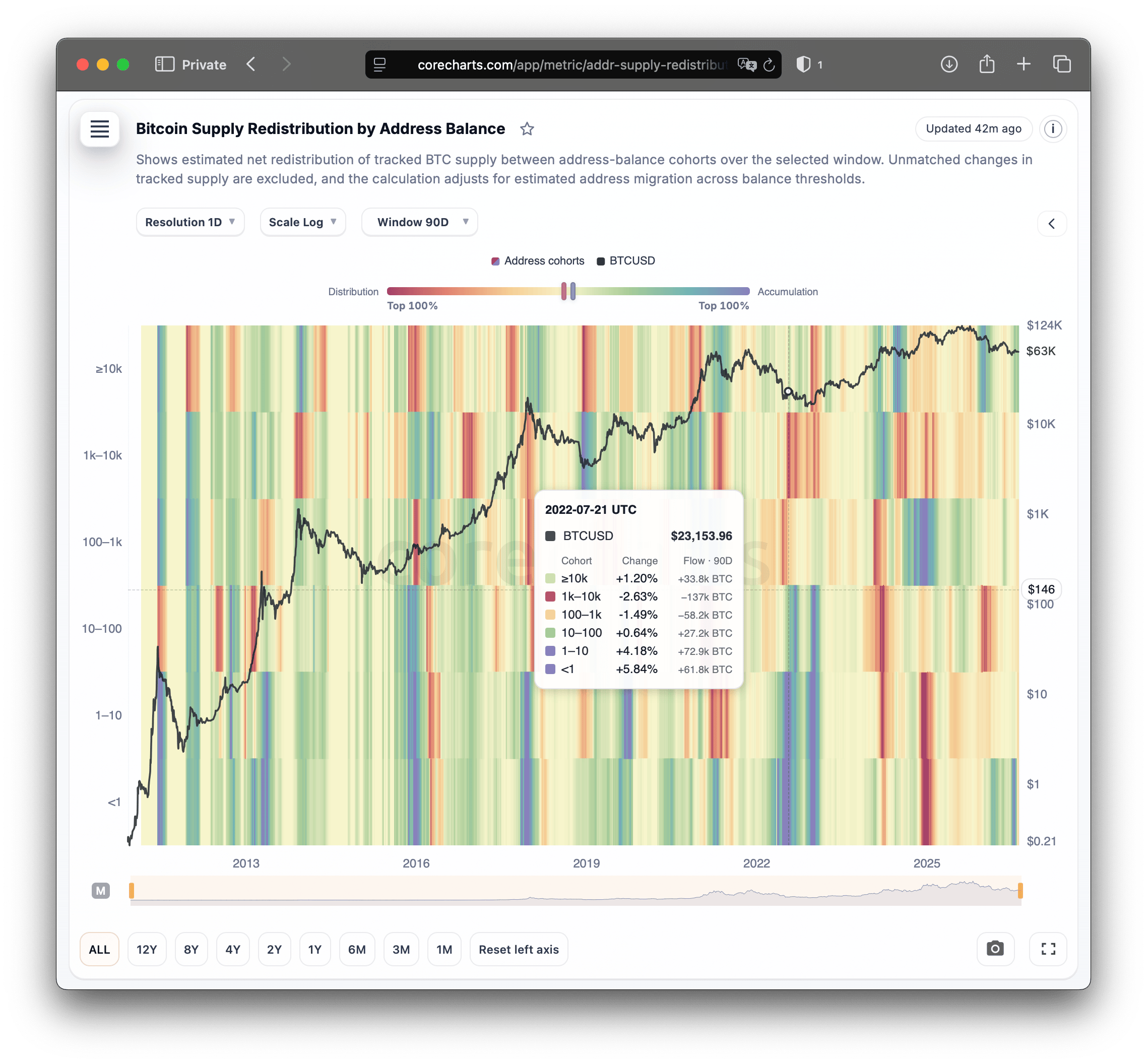
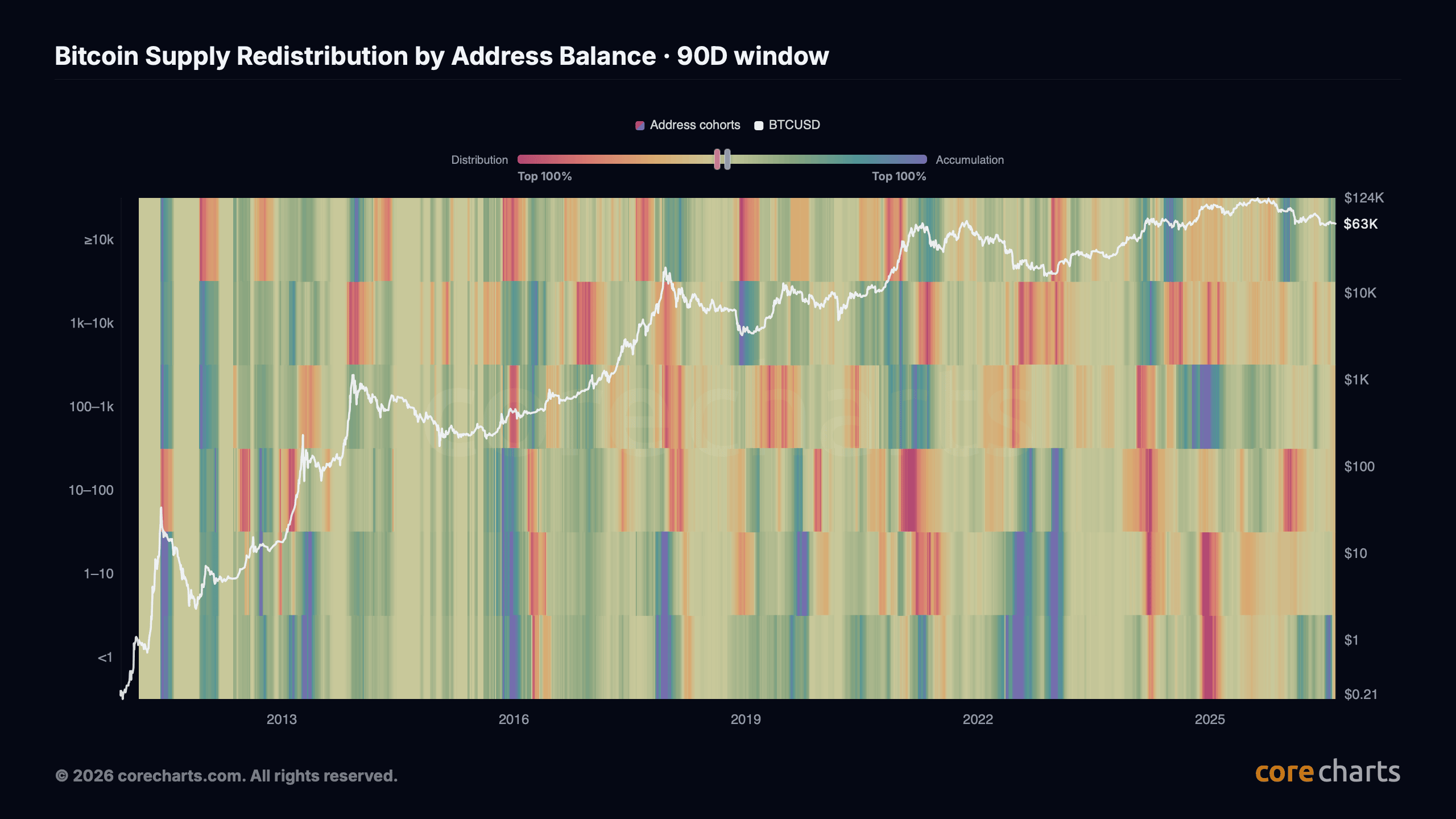
Accumulation colours indicate positive supply-neutral flow. Distribution colours indicate negative flow.
A positive ≥10k BTC cell means addresses in the largest balance cohort gained tracked supply over the selected window after the migration and supply-neutral adjustments. A negative value means the cohort lost tracked supply as part of the matched redistribution.
Base colour intensity follows the rolling historical midrank of the absolute neutralised percentage flow within each cohort's reference period. Magnitudes near the upper end of that history receive stronger colour.
The ranking is calculated separately for each cohort. A percentage move that is unusual for 1–10 BTC addresses can appear stronger than a larger BTC transfer in another band where comparable moves occur more frequently.
Directional persistence also affects colour intensity. Mostly one-way daily flow receives more visual weight than large movements that repeatedly reverse and largely cancel out.
The economic size of the flow also affects colour intensity. A move involving a larger share of tracked BTC receives more visual weight than a similar relative change involving a smaller amount of supply.
These adjustments affect colour only. The BTC flow and percentage shown in the tooltip remain unchanged.
The Top % control filters cells by the historical-rank component of colour intensity. Higher thresholds remove more ordinary accumulation or distribution observations from view without changing the underlying cohort flows.
Analysis Windows#
The available windows are 3D, 7D, 14D, 30D, 60D, 90D, and 180D. Each uses a rolling historical reference suited to its horizon.
The 3D window uses 21 days of history. It is sensitive to short bursts of address-level redistribution. A large transfer or brief accumulation episode can dominate this view and disappear once the movement reverses.
At 7D, the reference period increases to 30 days. A single daily shift has less influence as more days are aggregated.
Both 14D and 30D use 90 days of ranking history. The comparison baseline is the same, but the aggregation period differs. A pattern visible at 14D and absent at 30D is concentrated in the most recent two weeks rather than sustained across the full 30 days.
The 60D setting uses 180 days of history. The 90D view uses 365 days. Brief address reshuffling matters less at these horizons unless the movement remains large after several months of aggregation.
The 180D window is compared with 730 days of history. Temporary transfers lose influence when later movement offsets them within the six-month window.
The historical baseline rolls forward over time. An initially unusual flow can become less exceptional as similar observations enter the reference period. Colour may weaken even while the underlying neutralised BTC amount remains elevated.
Metric Summary#


The headline value is matched redistribution, defined above as .
Higher values correspond to more matched BTC; lower values to less.
Redistribution intensity normalises the matched amount by tracked supply and the selected window length. It expresses a window-level result on a daily-equivalent basis. Neutralisation is applied to the completed window rather than to each day separately.
The accumulation leader is the cohort with the largest positive supply-neutral flow in the active window. The distribution leader is the cohort with the largest negative flow.
The metric summary includes a MAD-based robust z-score against a 365-day baseline. It compares current redistribution activity with recent historical variability. MAD-based scaling reduces the influence of isolated extremes relative to standard-deviation scaling.
The z-score is distinct from the historical-rank measure used for heatmap colour and does not alter cohort flows.
Market Structure and Price#
The heatmap includes a BTCUSD price overlay. Price does not enter the redistribution calculation.
Persistent accumulation in larger balance cohorts while smaller groups distribute means tracked BTC is moving toward higher-balance addresses. During a price decline, the same pattern shows BTC concentrating in higher-balance addresses while spot moves lower.
During a rising market, distribution from higher-balance cohorts shows the opposite pattern. Higher-balance cohorts are releasing supply while other cohorts absorb the matched amount.
A sharp price move can coincide with subdued heatmap colour when cohort flows rank within ordinary recent ranges, reverse quickly, or remain small relative to tracked supply. Strong opposing colours during relatively stable price action indicate unusually active reallocation without a comparably large move in spot.
A pattern visible on 3D or 7D but absent at longer horizons reflects short-lived redistribution. Similar direction across 30D, 60D, and 90D means the net cohort movement remains after progressively longer aggregation periods.
Price direction does not establish the cause of redistribution. Address-level accumulation does not indicate who controls the addresses or why the BTC moved.
Relationship to Other Metrics#
Supply by Holder Size reports how much BTC is held in each balance cohort. Changes in those balances can reflect address migration as well as redistribution, while total tracked supply may change at the same time.
Bitcoin Supply Redistribution adjusts for estimated migration and removes unmatched net supply change before presenting the remaining movement across cohorts.
Address Balance Cohorts record how many addresses fall into each balance range. Changes in address counts contribute to the migration estimate. Address counts do not map one-to-one to people or entities.
Bitcoin Price provides the market overlay on the same timeline without entering the flow calculation.
The metric summary is calculated from the same adjusted cohort flows. It summarises matched activity for the active window and identifies the largest accumulating and distributing cohorts, while the heatmap shows how those flows developed over time.
Methodology Note#
Migration is estimated before flows are aggregated over the selected analysis window. The internal CoreCharts estimator uses daily balance and address-count changes.
The estimate is model-based because individual threshold crossings cannot be recovered exactly from aggregate address data. Some migration may therefore remain in the adjusted flows.
Addresses may enter and leave the same cohort on the same day with little or no net change in its address count. Mechanical reclassification can therefore remain after the adjustment.
CoreCharts does not apply entity clustering to this metric. Several addresses controlled by one owner remain separate observations. A single custodian may hold addresses across multiple balance cohorts.
Transfers between addresses controlled by the same owner can still appear as redistribution, including wallet reorganisation and consolidation. Movement into a larger address does not show that BTC changed hands between different people or entities.
Supply-neutral matching operates across the full six-cohort window. It identifies which balance groups accumulated and which distributed, but does not reconstruct direct routes between them.
If ≥10k BTC addresses accumulate while both 1–10 BTC and 10–100 BTC addresses distribute, the data do not establish how much of the larger cohort's inflow originated from either group.
Heatmap colour reflects the historical rank, persistence, and economic size of the adjusted cohort flow. The tooltip reports the cohort-level neutralised BTC and percentage values, while the metric summary shows aggregate matched redistribution and its leading cohorts.